First, examine the mock-up:
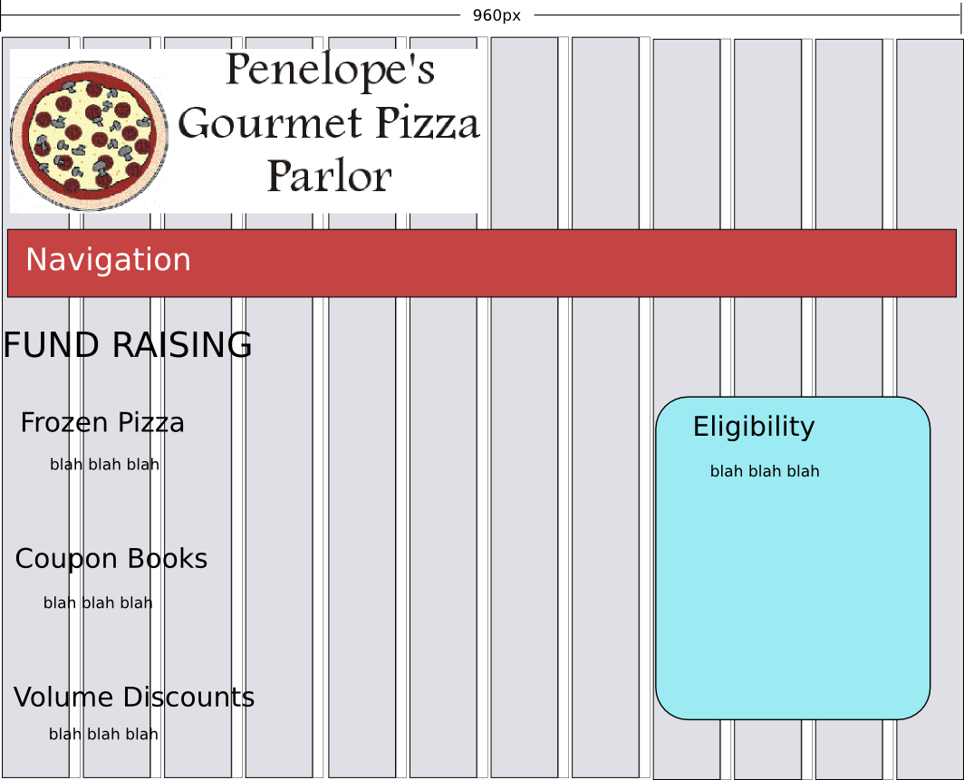
Note how the mock-up has 12 columns, each 70 pixels wide, with a 11-pixel "gutter" between columns.
For a starting point, we've provided a starter project in {Lab Installation Directory}/starters/lab08/lab08.zip.
As you have done in earlier labs, import this as an existing project into your workspace - you should end up with Lab08Web and Lab08EAR projects.
Examine the Lab08Web project, then run fundraising.html on the server to see what we've provided. Note that it's a fixed-width design - try resizing the window to 800 pixels wide and note that you need to scroll horizontally.
Examine main.css and note how it uses fixed-width, pixel-based measurements - all widths, font sizes and so forth are in pixels.
Let's first start by making the font sizes proportional:
-
The default font size in pixels for most browsers is 16 pixels. Looking at main.css, note how it specifies 24px for the section header h1 selector and 18px for section header h2. To calculate the proprotional size using the "simple calculation", simply divide the desired size by the context (the browser's default size). So for each selector:
Selector            Calculation    Result
--------            -----------    ------
section header h1    24 / 16        1.5em
section header h2    18 / 16        1.125em
Modify the stylesheet accordingly and retest - the output should be about the same as it was before, but now the size will scale properly on smaller screens.
-
Repeat the above to convert the h1 and h2 margin's to ems. Note: When the division results in a fraction, we recommend that you do NOT round it, but instead use as many fractional digits as possible. This will help prevent layout issues due to browser rounding off your measurements.
Retest.
Next, let's go about converting the fixed, pixel-based width to a fluid, responsive based layout that matches the mock-up as closely as possible.
-
Start by finding the CSS rule for #page that sets the width to 960px. Change the value to 90% - this will leave a bit of space (5%) on each side.
Then modify the #page's margin, deleting the pixel value, but leaving the auto.
The 90% figure is pretty much arbitrary, but a common choice for responsive designs.
Test your work so far - note how there's not much improvement, but this is a step in the right direction.
-
Next, let's work on the #main selector. The desired width is 900px - but it's contained with the #page, which has a nominal width of 960px. So applying the "simple calculation", target / context = result, we get:
900 / 960 = .9375 = 93.75%Modify the #main selector accordingly (be sure to remove the pixel-based margin), then test. Note the text and page flow better than before.
-
Repeat the above step for the fundraising-options and eligibility classes, replacing the pixel-based widths with a percentage. Note that the context of both elements is the #main section, which has a nominal width of 900px. Be sure to convert the division to a percentage by multiplying by 100, and don't round off!
Test your work so far - it should flow nicely as you resize your window. Try testing with a screen width of 320px (the pixel width of the original iPhone) - how does it look? Note how with that narrow of screen, the "Eligibility" box doesn't look very good. We will fix that shortly.
-
Next, let's change the padding values to ems instead of pixels. The "simple formula" still applies, but we need to modify it a little bit: For the context, it's the width of the element itself, not its containing element. Find the eligibility class in main.css and note that the padding-left is specified as 10px. Applying the formula:
10 / 243 = 0.04115226337449 = 4.115226337449%Modify the eligibility class's padding-left and test, the use the formula to modify the padding-right in the same fashion.
For the top and bottom paddings, instead of using the element's width as the context, use the browser's default font pixel height of 16 and then use ems like you did for the font size earlier. For example, the padding-top is currently 10px. Applying the formula:
10 / 16 = .625emModify both padding-top and padding-bottom accordingly, then test.
Note that you probably don't need to modify the border- radius and box-shadow values since they don't affect the page layout.
-
Finally, examine the fundraising-options class and note that it uses a pixel-based right margin. For margins, the context is the width of the containing element, which in this case, is nominally 548px. Apply the formula and set the right-margin accordingly. Then test. Your fluid grid should respond well to changes in the browser width (but there are still issues with the text).
Even though the fluid grid works pretty well, there are still issues with the responsive design. For one, the pizza-parlor logo is way too large when you make the window small. Luckily, there's an easy fix.
Modify main.css so it has the following rule:
img
{
  max-width: 100%;
}
Test with this change - the logo should resize as you change the window size.
Note that this is still not ideal - we are still sending the large logo in its entirety to the browser, using a far amount of bandwidth. A more optimal solution would be to enlist a server-side program to send differently sized images based on the browser's capabilities. That technique is beyond the scope of this lab.
Finally, if you have access to a real Web site on which you can upload files and you have a smart phone, upload fundraising.html, main.css and logo.gif and use your smartphone to browse to fundraising.html.
You will note that even though you have a nice responsive design, the browser will still scale the page as if it was a 960px fixed-width design! To defeat that scaling, edit fundraising.html and add this to the page head:
<meta name="viewport" content="initial-scale=1.0,
   width=device-width" />
Then re-upload the HTML file and refresh your smartphone's browser - you should see a more responsive page (though there still are issues with text overflowing).